The anchor
A constant name.
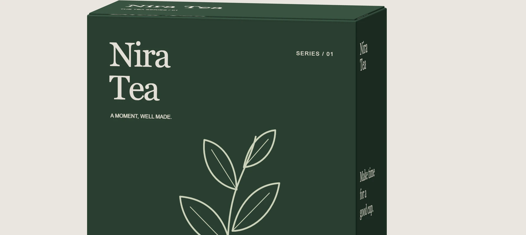
A stacked serif treatment stays fixed across the range. Consistent alignment gives the changing illustrations a stable reference.

01 / Identity & packaging / Self-initiated concept / 2026
A considered identity and three-blend packaging system, developed from a visual direction into editable artwork and modelled cartons.
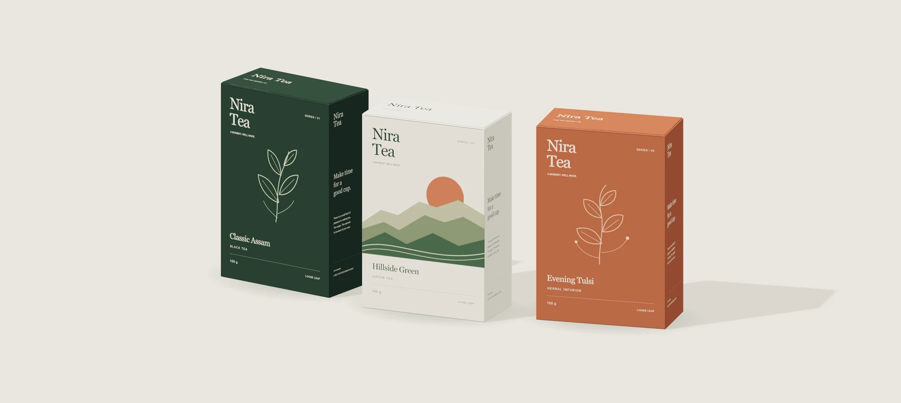
3D concept render made from the editable SVG panels. Not a photograph of manufactured packaging.
The brief we set
Imagine a tea brand that wants its packaging to feel calm and recognisable, while giving each blend its own place in the range.
The working brief was to connect a name treatment, colour palette and illustration direction across a carton rather than stop at a front label. Classic Assam, Hillside Green and Evening Tulsi are fictional products used to explore that system.
01 / A shared visual language
The brand name remains in the same position. Blend names, range numbers, colour and illustration give each product several ways to be recognised.
Name treatment / Georgia
A moment, well made.
Colour & character
The anchor
A stacked serif treatment stays fixed across the range. Consistent alignment gives the changing illustrations a stable reference.
The difference
Each blend has a name, category and range number. Colour supports the distinction instead of carrying it alone.
The extension
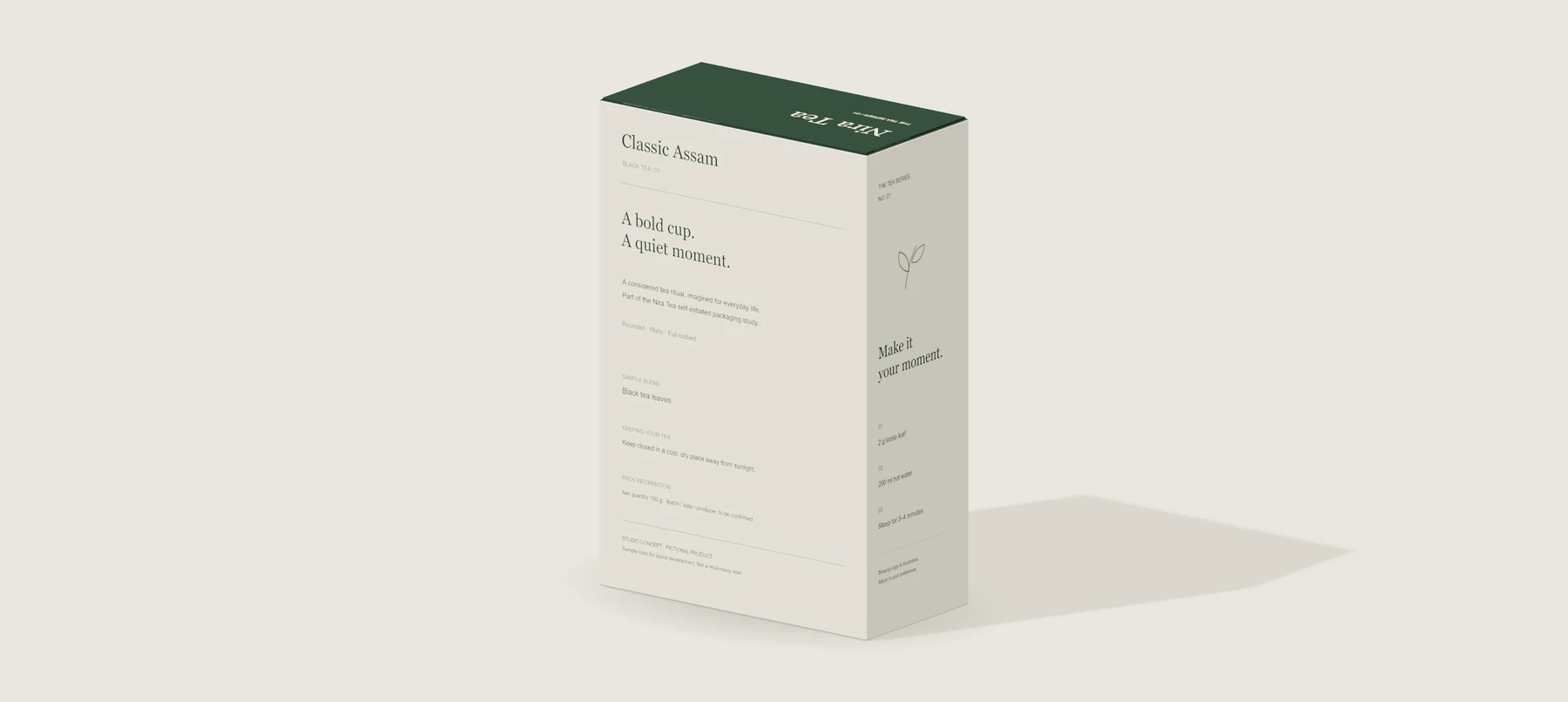
The side carries a short brand story; the back gives product information its own hierarchy; the opposite side sets out a sample brewing guide.
02 / Beyond the front
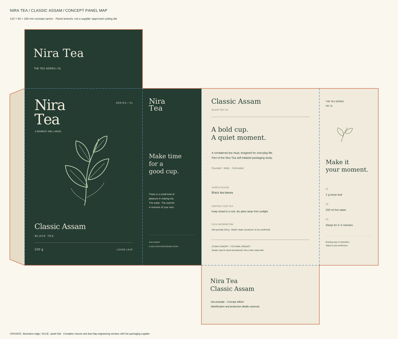
A consistent 120 × 60 × 180 mm concept structure gives the work physical proportions. The front, back, two sides, top and base each have their own editable file.
03 / Actual iterations
The earlier front-panel files were preserved before this revision. The comparison shows work actually produced for this study, rather than invented process photographs.
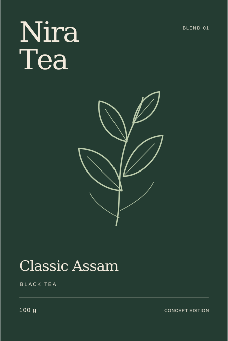
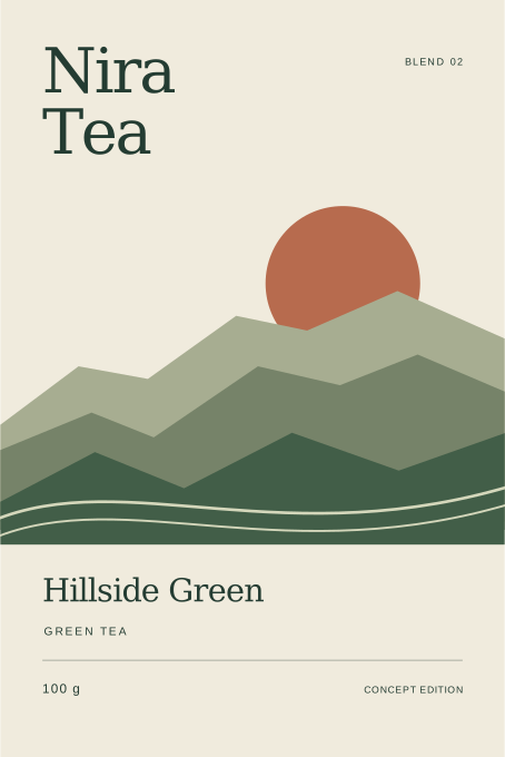
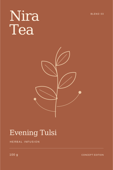
V1 / 23 October / Front-panel direction
Three flat fronts established the name, palette and illustration direction. Pack depth, back content and the relationship between faces were still missing.
V2 / 26 October / Complete concept presentation
Six faces per blend, an editable panel map and a shared carton model now connect the artwork. The same SVG files drive both the source handoff and the 3D views.
The handoff
Project scope
Self-initiated concept for a fictional brand. The artwork and 3D presentation were made for this study. Product names, quantity, blend descriptions and brewing copy are illustrative. No client commission, physical production, retail launch or customer research is represented. A real pack requires verified product content, supplier-approved structure and physical proofing. The earlier AI-assisted catalogue scene is archived; it is not used as the primary project image here.
Tell us about your brand, packaging or digital product.
Discuss your brief ↗Allow usage measurement to help us understand website visits and enquiry actions. You can change your choice in the footer. Privacy information